When I was at Portugal's national printing museum, I saw lead type stored like this:
Showing posts with label letterpress printing. Show all posts
06 January 2015
Cuts for printing Spanish playing cards / Planchas de imprenta (naipes)
These snapshots are from the Museu Frederic Marès in Barcelona. Marès was a Catalan sculptor. His statues speckle Barcelona. You've probably seen them at Montjuic and Pl. Catalunya. His home became a museum. The first floor houses his collection of Spanish figurative sculpture. The rest of it is one big cabinet of curiosities--comprised of anything and everything he could hoard.
Marès graduated from the school I attended last year, and later in his life, ended up directing it. The story I heard was that his hoarding actually gave birth to the book arts program. He needed somebody to bind all of his paper ephemera and photographs into albums.
Marès was, apparently, deeply quirky. He'd shuffle around his house/studio/museum, checking on his collections in his nightgown, well into his old age.
Anyway, I loved seeing these cuts for printing Spanish playing cards there.
______________________________________
Hice estas dos fotos en el Museo Marès de Barcelona. La casa de Marès, escultor catalán, se convirtió en museo mientras él vivía, y sigue siéndolo. En la primera planta se expone su colección de escultura hispánica. Las demás plantas son un gran gabinete de curiosidades que contiene todo lo que coleccionaba.
Marès estudió en La Llotja y llegó a dirigirla. Me contaron que, de la necesidad de encuadernar todos los recuerdos y fotos que guardaba, nació el Conservatorio de las Artes del Libro.
Marès era no solo excéntrico, sino muy así, andando por la casa-museo en zapatillas de casa para vigilar las colecciones.
Entre ellas hay unas pocas planchas de imprenta, incluso estas. Son para imprimir los naipes.
24 February 2014
Challenges of bilingual typesetting / Retos tipográficos del bilingüismo
Trabajo de técnico de conservación en un taller de reparación de libros. Hace poco, tiramos un acopio de libros de muestras de papeles y telas -- algunos tendrían 30 años. Esta impresión pertenecía a alguno de ellos. Creo que los tipos para esta impresión se han compuesto a mano. Lo que destaca es la diferencia entre el aspecto del italiano y del inglés -- mientras la composición luce en italiano, en inglés se ve un poco incómodo.
Puede que una tipografía haga lucir el italiano, pero no queda bien al inglés. El diseño de una tipografía debe de responder a la distribución de letras y las otras cualidades particulares al idioma al que se dirige.
Pero aquí no creo que veamos un diseño tipográfico descuidado, sino errores de composición que le dan un mal aspecto al texto en inglés. Las comillas ("Carta Varese") no se suelen ver así en inglés. Hay demasiado espacio entre renglones; hay una mala traducción ("Collection of and papers made"). El tener demasiado espacio entre palabras y líneas es porque la traducción del italiano al inglés era más corto que el texto original.
Lo que sí se ha hecho bien es: convertir las medidas de centímetros a pulgadas para la traducción al inglés. También la justificación del texto es mejor en inglés.
No publico esta entrada para criticar, injustamente, al cajista y traductor y corrector a quienes les tocó este pequeño trabajo. De haber hecho yo trabajos bilingües, sé lo difícil que es hacer que todo salga bien. Especialmente con la tipografía manual.
Es que la atención prestada a un texto en idioma extranjero para hacerlo lucir, sobre todo en un anuncio, ayuda a comunicarle respecto a otro público; también sirve para decirles a personas de otro país o cultura que nos importan.
______________________________
I work as a tech in a book conservation lab. A little while ago, we ended up throwing out thirty years worth of accumulated sample books of papers and bookcloth. This little letterpress printed piece accompanied one of them. It looks handset -- what caught my attention was that although the text looked beautiful in Italian, it felt awkward in English.
And it's true that good type design takes the distribution and other quirks of the 'target language' for which it has been designed into account.
But I don't think most of the awkwardness here is due to a bad type design. The compositor didn't always make great design calls for the English text (probably because he wasn't used to reading or setting it). For example, the quotations around "Carta Varese" aren't conventional in English. There's too much space between lines, and one sentence of the translation is a bit off ("Collection of and papers made"). Generally, the excessive padding around all the lines and words is due to the simple fact that the English translation was shorter than the Italian original.
The well-done aspects of this bilingual job include the conversion of the paper measurements from centimeters to inches for an anglophone audience. Also, the justification of the English text is better (by chance or design).
I'm not writing this post to slam either the translator or the compositor who would have worked on this. From personal experience, I know how challenging it can be to set two languages in the same job! Especially when you're dealing with lead type.
But the attention we pay to making another language look good, especially in an ad, goes a long way toward communicating goodwill to that second audience and telling them that they matter to us.
This is a bilingual post. If you notice a mistake, please correct my grammar (in either language!)
Publico esta entrada en castellano e inglés. Al notar faltas de ortografía y gramática, hacedme el favor de corregirme (¡el inglés tanto como el español!)
04 February 2014
First project for class / Primer trabajo del semestre
I'm in a letterpress printing class this semester! It has been months since I've touched a press; it felt good to print these.
Este semestre me toca una asignatura de tipografía manual. Hace meses que no imprimo. Que me esté de nuevo disponible una prensa me alegra.
The assignment was just to print ourselves business cards. The font I used for my name didn't have a label on it, so I don't know what it was. But rad, right?
El trabajo que nos pusieron era imprimir unas tarjetas sencillas. Saqué los tipos para componer mi nombre de una caja sin marcar; así no puedo decir el nombre del estilo. Pero es chulo, ¿no?
My only regret is that the spacing of my two phone numbers is maybe a little awkward. It's also great to print for yourself. I could get exactly how much impression I wanted (none), and use a paper that I liked.
Debería de haber jugado un poco más con el tracking de los números de teléfono. Ser mi propio cliente es lo mejor. Así estas tarjetas se imprimieron con poca impresión, como a mí me gusta.
The shop at school has these great gauge pins. THEY DON'T MOVE. This is going to change my life.
En el taller de la universidad hay unas supercapuchinas que NO. SE. MUEVEN. Me van a cambiar la vida.
Also, I've been listening to the album Nos sobran los motivos on repeat lately. It's what I was listening to while I was printing. I wish somebody would go through and translate Sabina.
Últimamente escucho mucho el disco Nos sobran los motivos, de Sabina, incluso mientras imprimía esta tarjetas. Quisiera que alguien hiciera alguna traducción al inglés de sus canciones.
This is a bilingual post. If you notice a mistake, please correct my grammar (in either language!)
Publico esta entrada en castellano e inglés. Al notar faltas de ortografía y gramática, hacedme el favor de corregirme (¡el inglés tanto como el español!)
Este semestre me toca una asignatura de tipografía manual. Hace meses que no imprimo. Que me esté de nuevo disponible una prensa me alegra.
The assignment was just to print ourselves business cards. The font I used for my name didn't have a label on it, so I don't know what it was. But rad, right?
El trabajo que nos pusieron era imprimir unas tarjetas sencillas. Saqué los tipos para componer mi nombre de una caja sin marcar; así no puedo decir el nombre del estilo. Pero es chulo, ¿no?
My only regret is that the spacing of my two phone numbers is maybe a little awkward. It's also great to print for yourself. I could get exactly how much impression I wanted (none), and use a paper that I liked.
Debería de haber jugado un poco más con el tracking de los números de teléfono. Ser mi propio cliente es lo mejor. Así estas tarjetas se imprimieron con poca impresión, como a mí me gusta.
The shop at school has these great gauge pins. THEY DON'T MOVE. This is going to change my life.
En el taller de la universidad hay unas supercapuchinas que NO. SE. MUEVEN. Me van a cambiar la vida.
Also, I've been listening to the album Nos sobran los motivos on repeat lately. It's what I was listening to while I was printing. I wish somebody would go through and translate Sabina.
Últimamente escucho mucho el disco Nos sobran los motivos, de Sabina, incluso mientras imprimía esta tarjetas. Quisiera que alguien hiciera alguna traducción al inglés de sus canciones.
This is a bilingual post. If you notice a mistake, please correct my grammar (in either language!)
Publico esta entrada en castellano e inglés. Al notar faltas de ortografía y gramática, hacedme el favor de corregirme (¡el inglés tanto como el español!)
19 January 2014
SOCIAL/BRIEF: Blank Slate
I went to this event in Minneapolis at the Walker Art Center while I was home recently.
I thought it was a cool collaboration because letterpress printing usually does not happen in a modern art museum. Craft and contemporary art may attract different audiences. Because most of the magic of letterpress printing happens behind the scenes, it can be a fairly opaque process.
Here, printer Jenni Undis of Lunalux is setting some of the poems that were read at the event in type, and printing small editions of them on a tiny press. Lunalux prepared for the evening by printing the name of the event on the back of each card and numbering them before printing. They also have "live" printing events at their own shop sometimes.
Here photo corners are being used instead of gauge pins.
A handful of the editioned prints:
24 January 2013
Test run
Here is what I printed for my test run of the platen press we have in the bookbinding studio. The text is the is the name of my school.
I think this wood type is actually Spanish, which makes it special. There were not a lot of forests to make wood type out of in Europe, which is why wood type is very much a new world thing, but in Spain, I guess a lot of wood type was burned for fuel during the civil war. (Conjecture or fact? I'm not sure). The stuff that survives is pretty worn down (some too much to pull a decent print from it). We actually have a tool in the shop for measuring how high a piece of type is, so that we can add pieces of backing to it if it's not type high.
The metal type is Ibarra Redonda.
I think this wood type is actually Spanish, which makes it special. There were not a lot of forests to make wood type out of in Europe, which is why wood type is very much a new world thing, but in Spain, I guess a lot of wood type was burned for fuel during the civil war. (Conjecture or fact? I'm not sure). The stuff that survives is pretty worn down (some too much to pull a decent print from it). We actually have a tool in the shop for measuring how high a piece of type is, so that we can add pieces of backing to it if it's not type high.
The metal type is Ibarra Redonda.
13 January 2013
itsy bitsy teeny tiny ... print shop
When I was browsing through Neufville Type's 1913 catalog, I came across this little snippet -- "una imprenta minúscula."
Here's a rough translation:
"In New York City, in an unintentional gap between two buildings, what is reported to be the world's smallest print shop has recently been opened. The aforementioned gap, which measures 34 inches by 16 feet, is now home to a handsome letterpress printing shop. The proprieter pays a sum of $600 a year in rent, and the shop is sucessful, thanks to the hundreds of people who walk by it daily to make the crossing from New Jersey to New York (and vice versa). The front door is 16 inches wide, with a window display occupying the remaining 18 inches of the facade that features a 'card press' [probably a tabletop platen]. If the owner is facing the front door straight on he fills the entire width of the establishment."
Here's a rough translation:
"In New York City, in an unintentional gap between two buildings, what is reported to be the world's smallest print shop has recently been opened. The aforementioned gap, which measures 34 inches by 16 feet, is now home to a handsome letterpress printing shop. The proprieter pays a sum of $600 a year in rent, and the shop is sucessful, thanks to the hundreds of people who walk by it daily to make the crossing from New Jersey to New York (and vice versa). The front door is 16 inches wide, with a window display occupying the remaining 18 inches of the facade that features a 'card press' [probably a tabletop platen]. If the owner is facing the front door straight on he fills the entire width of the establishment."
08 January 2013
Madrid (Madrid!)
Here is a photo of Barcelona:
Yes, that is a gigantic sculpture of pasta being transported. That shape is called 'galet' and they are a special Christmas food here. But the first time I saw them hanging out on the rambla, I thought they were some kind of surrealist public art.
But, I didn't spend much of Christmas break in Barcelona. 8 hours after my last class and a ride sharing adventure later, I was in Madrid to see this girl:
See all the gorgeous lights:
Eat vegetarian food with other Americans!!!
Get lost on the cercanías trains (thanks, metro strike) and end up poking around old train depots:
See more pretty lights:
I also went to my favorite bookstore, which has literary events in its basement:
And of course has a bar inside (this is Spain we're talking about). What I love is the tree inside, and how they kept a lot of the features of the original building, like the cupola above.
Yes, that is a gigantic sculpture of pasta being transported. That shape is called 'galet' and they are a special Christmas food here. But the first time I saw them hanging out on the rambla, I thought they were some kind of surrealist public art.
But, I didn't spend much of Christmas break in Barcelona. 8 hours after my last class and a ride sharing adventure later, I was in Madrid to see this girl:
See all the gorgeous lights:
![]() |
| Plaza del Sol |
Eat vegetarian food with other Americans!!!
![]() |
| Add caption |
Get lost on the cercanías trains (thanks, metro strike) and end up poking around old train depots:
See more pretty lights:
![]() |
| Plaza Mayor. There was a carousel! |
And hang out at bookish locations, like the Imprenta Municipal. They let me use their library and I got to sit in on one of their workshops.
![]() |
| Seeing this little guy get excited about lead type makes me feel all warm and fuzzy inside. |
![]() |
| The museum has inherited all of Bauer's type. |
![]() |
| Ibarra Redondo heck yeah. |
I also went to my favorite bookstore, which has literary events in its basement:
And of course has a bar inside (this is Spain we're talking about). What I love is the tree inside, and how they kept a lot of the features of the original building, like the cupola above.
07 October 2012
Love Conquers All
Love of printing, that is.
Jon Drew let me work on this press to do a wedding invite job! One of the reasons the book arts community is so great is that experienced printers and binders are so generous with their time in teaching young people and other learners.
![]() |
| This 8x12 C&P was manufactured December of 1895. |
04 October 2012
{ speedy gonzales
Start to finish, an hour and 15 minutes.
I felt so speedy and on top of the world. Like when there is a tailwind and I am biking.
01 October 2012
The biggest fan of your art ...
... will always be your mom. She put your art up on the fridge before you were famous. If you're lucky she still does.
These notecards were for my mom. The white on white is elegant, but the lower case initials at an angle keep the cards from feeling too formal for everyday notes.
![]() |
| Jackson Pollock's mother. Start em young! |
Tessellating prints!
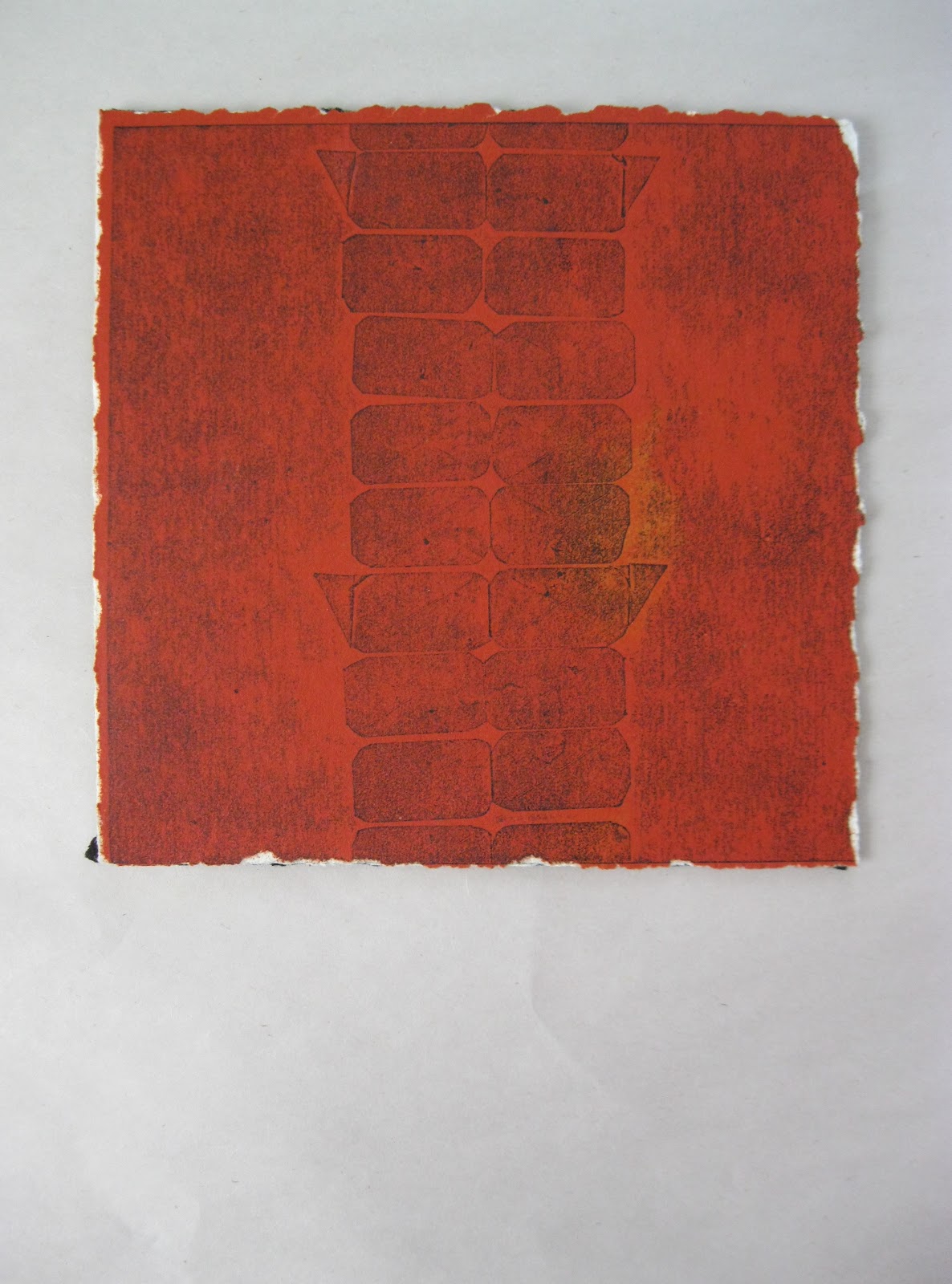
The Roman aquaduct in Segovia is really old but it never really gets old. Sometimes I even think about it while I am not in Segovia and make prints about it.
Pressure prints.
I mixed this rich orange, with flecks of yellow, on a fiberglass slab and ran it through a combo press first with the paper (stonehenge).
Then I tore it down, to get the contrasting fake deckle, and letterpress printed a pressure plate over the top. (The plate was sticker paper attached to cardboard to make a very shallow relief. Then mounted to a boxcar base).
One of the consequences of choosing to produce an image as a print is that multiple originals are produced. Tessellating prints showcase that characteristic of printmaking.
I wanted to capture the weathered, irregular surface of the stones.
I backed the prints with two layers of black BFK. The cut paper design on the back is a puzzle.
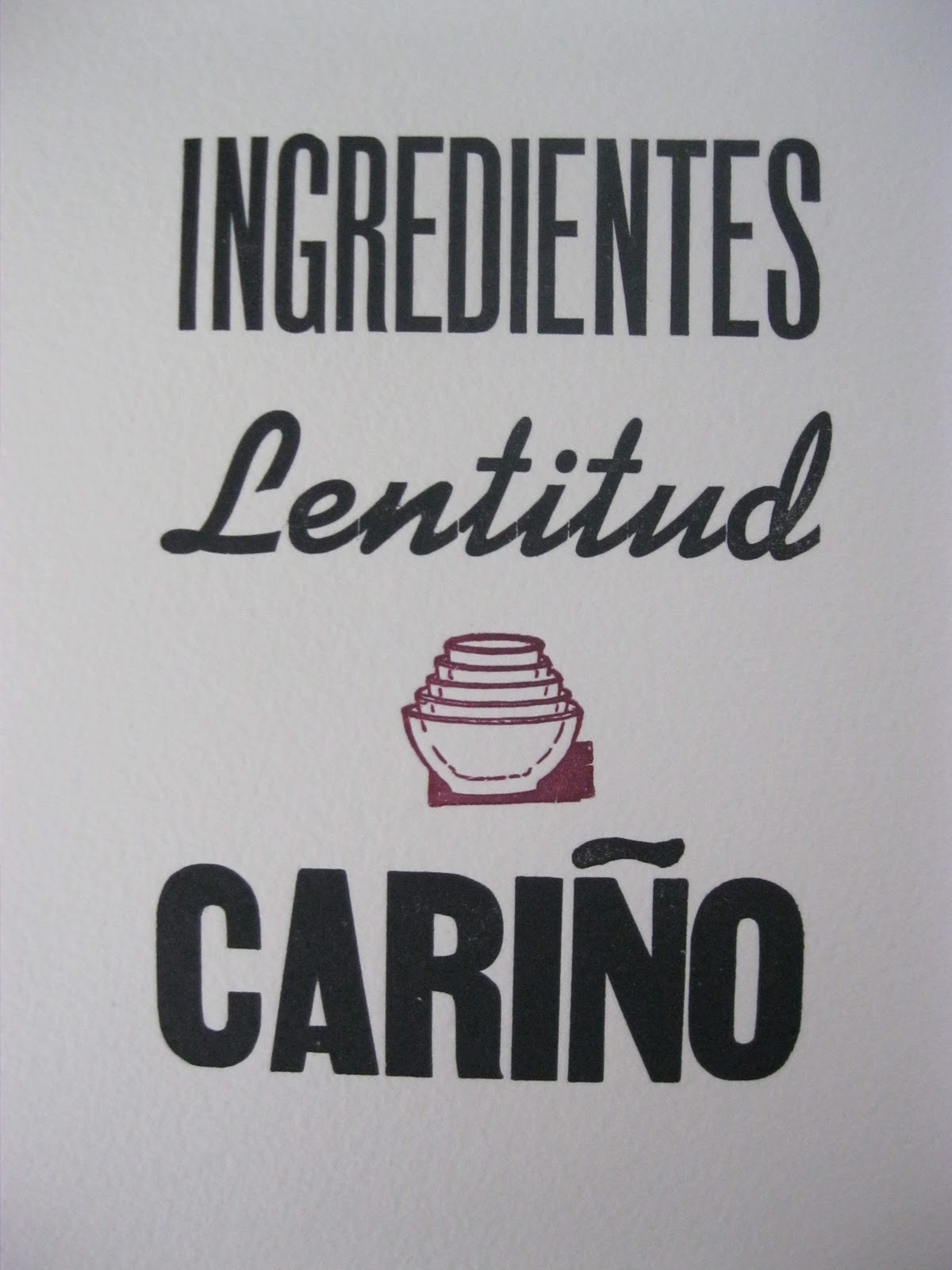
Ingredientes, lentitud & cariño
Wise words to cook by. This is a kitchen print ... a reminder to cook everything slowly, with good ingredients and, of course, love. I made it for my Spanish host mom, who told me this about cooking.
They are 5 x 7" and I printed them on some Hahnemuhle paper I found in my the stash under my bed. I damp packed the paper before printing.
The 'Ñ' is klutzy since I carved it myself; I'm so excited to be in Spain where they have REAL ones.
Is it a bird? A plane? A beehive? The cut from the studio at Leg Up is supposed to be stacking bowls.
They are 5 x 7" and I printed them on some Hahnemuhle paper I found in my the stash under my bed. I damp packed the paper before printing.
The 'Ñ' is klutzy since I carved it myself; I'm so excited to be in Spain where they have REAL ones.
Is it a bird? A plane? A beehive? The cut from the studio at Leg Up is supposed to be stacking bowls.
Business cards for a flower shop
![]() |
| Photo credit: Satori |
Threaded with twine, these business cards double as enclosure cards for flower arrangements.
Love printing with a deckle.
Subscribe to:
Posts (Atom)